7 Inspiring Cleantech Websites: Showcasing Innovation and Design
Cleantech companies are the wave of the future, looked to as leaders in technological innovation. People look to cleantech for ideas that are unique and cutting-edge — and their websites should reflect that.
To stand out, cleantech websites need to have a clear mission, concise storytelling, and strategic web design elements that convert leads. But no matter what your business is, your website should be accessible, smart, and straight to the point.
Before designing or refreshing a site, it helps to know how to spot a good one. Specifically, you need to consider:
- What design elements can help make your website sales-ready.
- How to maximize your potential output.
- How to make the most of your digital assets.
Running 7 Cleantech websites through our Website Grader
With that in mind, we gathered some of the most inspirational examples of cleantech websites out there. We assessed each for design, storytelling, speed and performance, and lead magnets — and ran them through our New Perspective website grader as well.
Here are what we consider the top seven. Each has its own strengths, but all embody the cutting-edge sensibility of cleantech:
Carbon Clean
Carbon Clean provides carbon capture technology to industrial emitters at a gigatonne scale, helping to achieve net zero carbon emissions through a full process design package, proprietary equipment, and end-to-end systems.
Design
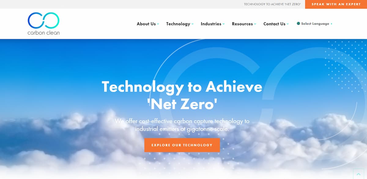
From the get-go, Carbon Clean’s sleek web design gives off an airy aesthetic, almost like we’re on cloud nine. They nail the first impression with a straightforward, one-sentence description of their mission above the fold. The user is encouraged to explore further through clear and compelling navigation links.
Storytelling
Carbon Clean’s site tells a story. They are working to solve some of the most important issues of our time with their innovative technology — which has removed over a million metric tons of carbon from 38 facilities around the world. The site provides in-depth technical content while making it digestible with supporting graphics and videos.
Carbon Clean also does a great job of backing their claims up with facts, supporting their inspirational technology with concrete success stories across various industries.
Speed and performance
Their overall New Perspective website grade is 59/100, with:
- Good image size and browser caching
- Minimal page redirects
- Concise CSS
Effective lead magnets
Carbon Clean provides a lot of opportunities for the user to engage with their brand and learn more about how their cleantech services address their target audience’s challenges. The site offers multiple conversion points for visitors within each stage of the buyer’s journey.
Their “Resources” section provides insightful and targeted content and enticing lead magnets, including:
- Gated webinars
- Detailed reports
- Branded eBooks and whitepapers
Dandelion Energy
Dandelion Energy offers energy-efficient and cost-effective geothermal heating and cooling systems that replace traditional HVAC equipment. Through the use of underground pipes, cool air and heat are cycled from the Earth and then throughout the home, reducing air pollution and eliminating the need for the use of fossil fuels.
Design
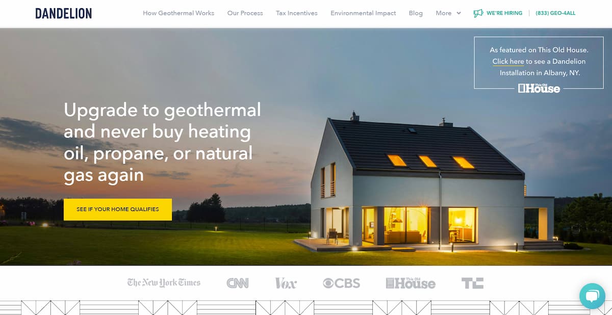
This cleantech company knows that they need to make the benefits of geothermal energy immediately clear to potential customers, embracing what we at New Perspective call the big dumb seal theory. Assume customers have the attention span of a seal — and do everything you can to keep that attention. Dandelion does just that by including:
- Clear and concise calls to action
- Well-organized, visually appealing content
- High-quality images, video, and diagrams
Dandelion wastes no time in capturing the viewer’s eye — enticing them from page to page and making them want to learn more.
Storytelling
Dandelion targets their customer and communicates the value proposition immediately: “Upgrade to geothermal and never buy heating oil, propane, or natural gas again.” Through animated GIFs, videos, and illustrations, they show visitors exactly how geothermal heating and cooling works.
Their messaging clearly educates the customer as to the benefits of geothermal energy use. When highlighting their environmental impact, Dandelion stays humble, championing their customers and noting that without them, there can be no real change.
Speed and performance
Dandelion Energy earns a New Perspective site grade of 62/100, with:
- Fast and light page size
- Minimal page redirects
- Proper image sizing
- Browser caching
- Compressed JavaScript and CSS
By minimizing page requests and some adjustments to page interaction, the site’s performance could be easily up-leveled.
Effective Lead Magnets
Dandelion Energy understands their target audience, with CTAs that address pain points clearly. Big yellow buttons that say “See If Your Home Qualifies” are placed multiple times on each page of the site: Dandelion doesn’t miss any opportunity to collect a lead.
They have clear calls-to-action to “Get Started for $0 Down” and “Get in Touch.” Their phone number is displayed in both top and bottom navigation panes for ease of use.
MICATU
Micatu is an optical sensor company that cares about energy and the way it is delivered — cleaner, safer, and more reliably. Its Gridview Sensor Platform delivers actionable, real-time data straight from the field to electrical utility operators.
Design
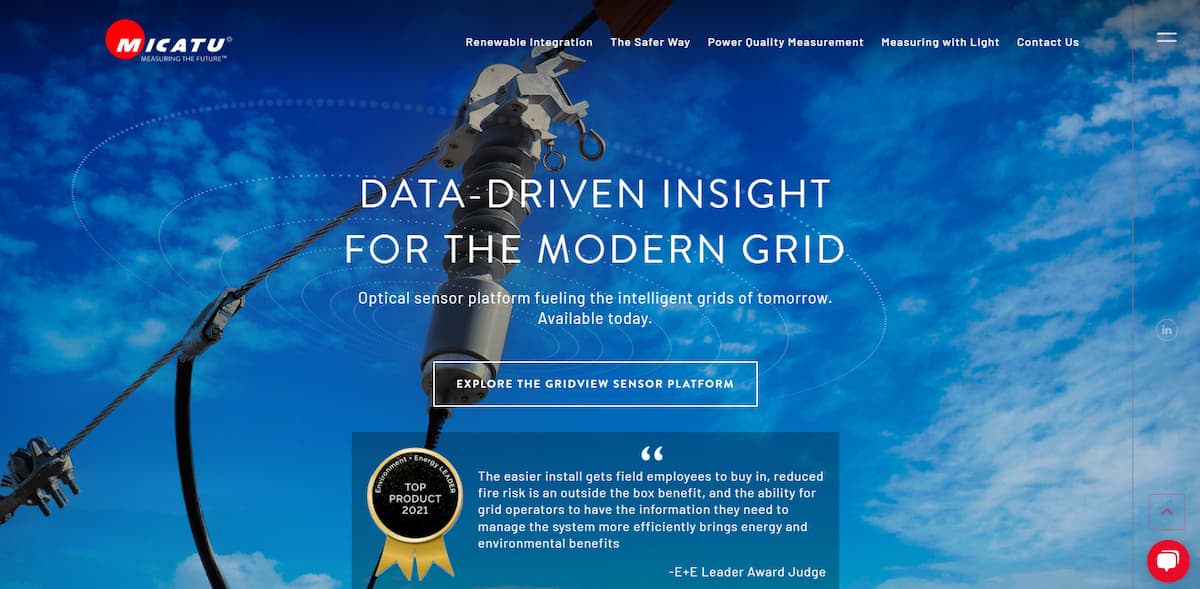
When you visit Micatu’s site, the first thing you see is a succinct description of what they do, followed by a credible quote that communicates industry pain points and emphasizes Micatu’s solutions to those challenges.
High-quality images are paired with simple language and a sleek, modern, easy-to-use interface, making for an overall pleasant website experience.
Storytelling
It’s clear that Micatu knows their customer, empathizing with challenges and providing solutions throughout the site. They also do a great job of communicating their company origin story.
Micatu explains that they were the first to commercialize the next generation of highly accurate grid measurements and analytics through modular, optical sensing tech that’s affordable, accurate, and safe. By communicating their passion for sustainability, they make you want to be a part of the smart grid revolution.
Speed and performance:
Micatu earns an overall page grade of 56/100, according to New Perspective’s website grader, including:
- A focus on killer messaging and design.
- Clarity and breadth — there’s a lot to learn, so here’s where information can be more important than speed.
But with some slight tweaks to page size and the number of HTTP requests per page, overall speed could dramatically increase.
Effective lead magnets
Conversion points are peppered throughout the Micatu site. There’s a “Contact Us” button on every page with appealing language about transforming how we collect grid data.
Additionally, there’s a chat box readily available for instant, anytime communication, and multiple product brochures function as effective lead magnets.
75F
75F offers an Internet of Things (IoT) Building Management Solution (BMS) that helps:
- Improve indoor air quality
- Save energy
- Reduce operational costs for commercial buildings

The system includes cloud-based software that offers predictive building automation, wireless sensors, and equipment controllers.
Design
The homepage is expertly designed to not overwhelm the viewer, with easy-to-digest text modules and attractive icons. The white background keeps things simple, with a dark orange (their primary color) serving as an accent throughout, and selected imagery that makes the site pop.
Storytelling
75F uses a balance of graphics, video and text, enabling every lead to absorb information the way that’s more comfortable for them. Their navigation includes a clear menu showing who they serve. A dedicated page for each customer niche leads to the unique benefits of their products and services.
While they could do a bit more to emphasize their mission and origin story, proof of their successes abounds — with multiple case studies to prove their value.
Speed and performance
With a New Perspective website grade of 56/100, the business does an excellent job, with:
- Minimal page redirects
- Concise CSS
- Top-notch browser caching
Making adjustments for page speed and reducing HTTP requests and page size would take their site to the next level.
Effective Lead Magnets
One of the first elements you spot on the homepage is the primary call-to-action to talk to an expert. There’s a chatbox on the bottom right of every page, and “Contact Us” links at the top and bottom.
There are also multiple opportunities to enter your email to download free ebooks catered to industry-specific pain points.
WindESCo
WindESCo is an analytics and software provider that uses patented algorithms to monitor and analyze high-resolution wind turbine data. They discover anomalies and measure annual energy production (AEP) improvements to make energy use more efficient.
They also increase revenue for wind turbine investors and owners.
Design
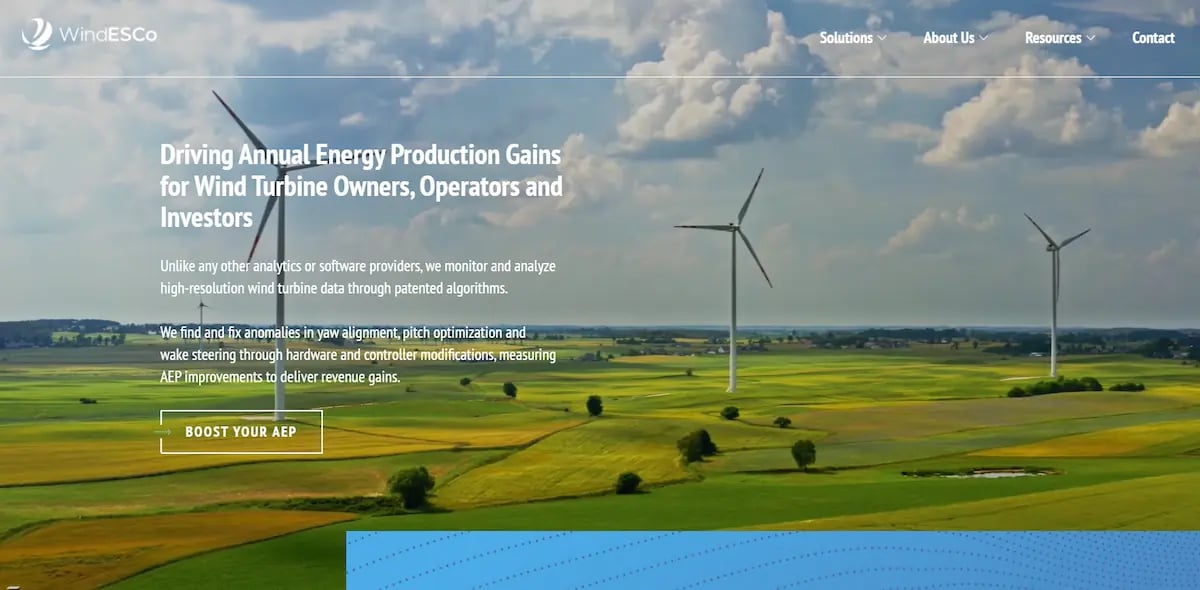
WindESCo nails the first impression. The first thing we see is an engaging video of green fields and blue sky, with wind turbines spinning slowly. The site’s color coordination and clean lines are visually delightful. The top navigation links are limited to four categories, not overwhelming the user.
Storytelling
When it comes to delivering information, WindESCo doesn’t mince words. For instance, each section of the site uses concise language to describe the value and impact of what they do.
They expertly use numbers and percentages to tell success stories and communicate revenue and energy gains, for example. While they could benefit from making their personal mission and origin story more prominent, overall, they clearly communicate their value.
Speed and performance
With a website grade of 67/100, WindESCo has it tackled some of the most important optimization tasks including:
- Browser Caching
- Minimal page redirects
- Properly compressed CSS and JavasScript
With just a few changes to page size and the number of HTTP requests, they could get a score of 100 in no time.
Effective Lead Magnets
WindESCo’s delivers a promise and backs it up with case study data.
WindESCo also makes it easy to engage by incorporating newsletter signup and book a meeting with an expert conversion points throughout the site.
Aurora Solar
Aurora Solar is a platform that helps solar companies streamline their processes. Users of their platform can more easily create engineering designs and sales proposals. Because of this, they can gain more customers and increase solar adoption at scale.
Design
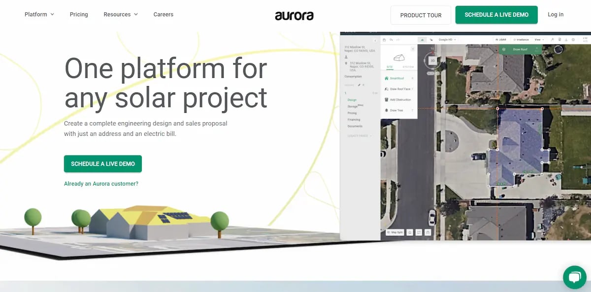
The first thing you see when you land on the homepage of this cleantech solar company are a screenshot of their platform and a digital mockup of a building with solar panels — as you might see in a good proposal about where to best use them in your building.
The straightforward imagery is a welcome contrast to other sites: it conveys a sense that this company offers practical solutions and knows what they’re doing. Navigation is simple and to the point.
Storytelling
Starting with the first impression, Aurora targets the customer, quickly addressing their pain points right on the homepage. Then, they offer a solution: “Create a complete engineering design and sales proposal with just an address and an electric bill.”.
They immediately explain how their product works, utilizing case studies and imagery of their platform. Their mission of creating a future of solar energy for all is not only apparent, it seems all the more possible, given their platform.
Speed and performance
With a New Perspective website grade of 72/100, Aurora Solar nails it when it comes to:
- Browser Caching
- Minimal page redirects.
- Properly compressed JavaScript and CSS.
By making a few modifications to image and page size and HTTP request management, they could markedly improve overall site speed and performance.
Effective Lead Magnets
When it comes to converting leads, Aurora doesn’t waste any time.
The first time you visit the homepage, a pop-up window appears saying: “See the best ways to reduce shading losses in PV systems,” with a button that says “Show me!” On every page of the site, there’s a chat box.
There are also calls-to-action that say: “Schedule a live demo,” “Product tour,” and “Learn more.”
They offer 11 separate case studies available for download, and a “Big Book of Solar Software Must-Haves.”
Camus Energy
Camus Energy is a next-generation grid management platform for utilities and energy providers to help better utilize power and reduce carbon emissions. Using AI and machine learning, they offer:
- Real-time data
- Forecasting
- Scheduling and more
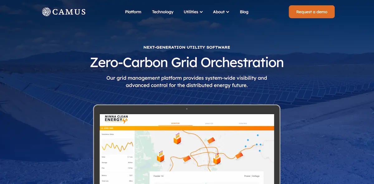
Their goal is to empower grid operators to gain better control of local resources.
Design
It’s clear from the start that uniformity is a priority in their design, with complementary colors and a white background giving the site a clean, organized, grid-like look. (And for a grid-management platform company, what could be a better aesthetic?).
Their content has a good balance of information and imagery, breaking up text into easily digestible blocks with intuitive navigation.
Storytelling
Their language strategically targets personas, using lines to empower potential customers such as:
- “Gain access to tools and grow on your own terms.”
- “Optimize operations.”
- “Boost resilience.”
Their mission statement is clear and repeats throughout the site, letting people know that they want to equip grid operators with the tools they need to “navigate tomorrow’s complex grid.”
Speed and performance
With an impressive New Perspective website grade of 76/100, Camus Energy excels in:
- Optimal page size
- Caching
- Minimal redirects
- Proper image sizing
- Minified JavaScript
With this in mind, by adjusting excess CSS, page speed, and interactivity, this cleantech website could go from great to greater.
Effective Lead Magnets
Opportunities to schedule or request a demo are rampant throughout the site, and a contact form is at the bottom of each page. In addition, they offer opportunities to download multiple whitepapers on different subjects, appealing to the various interests of potential customers, providing multiple entry points for grabbing leads.

Cutting-Edge Cleantech Websites: Conclusions
Above all, cleantech groups and cleantech organizations are driven by a growth mindset, with innovations that transform sectors. With this in mind, it’s vital that your digital marketing assets communicate the quality of your products and services and present your value clearly.
Sustainable innovation is driving the world forward. Ensure your organization has a website design strategy that drives your business forward too.
Frequently Asked Questions
What makes a high-performing cleantech website?
A high-performing cleantech website combines clear messaging, strong visual design, fast performance, and conversion-focused elements like CTAs and lead magnets. It should quickly communicate value while guiding users toward action. Learn how this connects to sales-ready website design and SEO services.
How should cleantech companies structure their website for lead generation?
Cleantech websites should be structured to guide visitors through the buyer’s journey, with clear navigation, targeted landing pages, and multiple conversion points such as demos, downloads, and contact forms. This approach helps turn traffic into qualified leads. See how this aligns with demand generation and inbound marketing.
What role does storytelling play in B2B website design?
Storytelling helps B2B companies explain complex technologies in an engaging, easy-to-understand way. Strong narratives build trust, highlight impact, and make technical solutions more accessible to decision-makers. Explore how this is applied in content & creative services and industrial manufacturing marketing.
Why is website performance important for B2B and cleantech companies?
Website speed, responsiveness, and technical performance directly impact user experience, search visibility, and conversion rates. Even small improvements in load time and usability can significantly increase engagement and lead generation. Learn more about SEO services and paid search management.
How can a B2B marketing agency improve website performance and conversions?
A B2B marketing agency can improve website performance by aligning messaging, design, and technical SEO with business goals, while also optimizing conversion paths and user experience. This includes everything from strategy and design to ongoing optimization. See how this works through our process and client results.


