B2B Engine Theme
Thank you for downloading B2B Engine, a theme built to help companies in the business-to-business space create a strong website presence using the HubSpot CMS. This documentation will cover the fundamentals of using and customizing this theme to reflect your brand and showcase your content. Questions that fall outside of the scope of this document can be sent to our support team at themesupport@npws.net.
Getting Started
1. Theme Installation
After you have successfully completed your purchase of the B2B Engine theme from the HubSpot Marketplace, you can find it by navigating to the ‘Design Tools’ section under ‘Files and Templates’ in your Marketing portal. (Marketing > Files and Templates > Design Tools). Please allow up to 5 minutes for the theme installation to be completed.
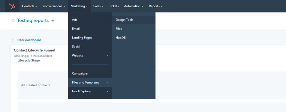
You will then be able to find all of the coded files for your theme in a folder named ‘B2B Engine’ in the sidebar of your Design Manager under the @marketplace folder (@marketplace > New Perspective > B2B Engine).
2. Creating a Child Theme
Before you begin using and customizing your new theme, we highly recommend that you create a child theme. A child theme allows you more options to customize CSS, JavaScript, and modules, while still being able to receive updates through the Marketplace.
Creating a child theme is as easy as right clicking on the theme folder in your Design Manager sidebar (Marketing > Files and Templates > Design Tools), and selecting the ‘Create child theme’ option.
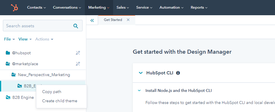
Now if you need to edit the code of a module you can clone it from the main theme to the child theme. Right click on the file you wish to customize and click Clone to child theme.
.png?width=953&height=628&name=clone-to-child-theme%20(1).png)
Theme Customization: Theme Settings
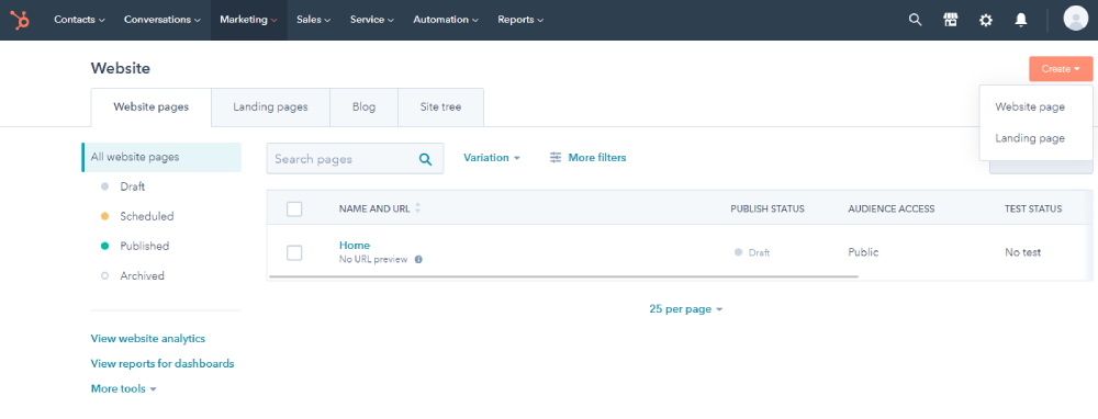
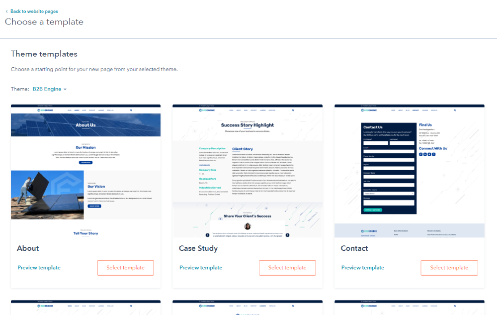
Now comes the fun part, updating the theme to represent your brand. Almost all of the customization will be accomplished by editing your theme settings. Before you can do that, you will first need to create a new website page using one of the templates from your cloned version of B2B Engine.
Navigating to Theme Settings:
1. Create a Website Page
2. Choose a Page Template
Once you are in the Page Editor, navigate to the ‘Theme’ tab in the sidebar, from there you will be able to select ‘Edit Page Settings’.
3. Select ‘Edit Theme Settings’ from the Design Tab in the Page Editor
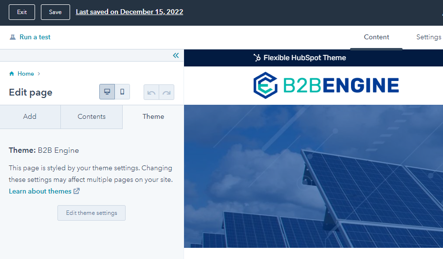
Customizing Your Theme Settings:
Once you are in the Theme Settings you will have multiple options for what you can customize. Lets walk through each of the theme settings you can customize:
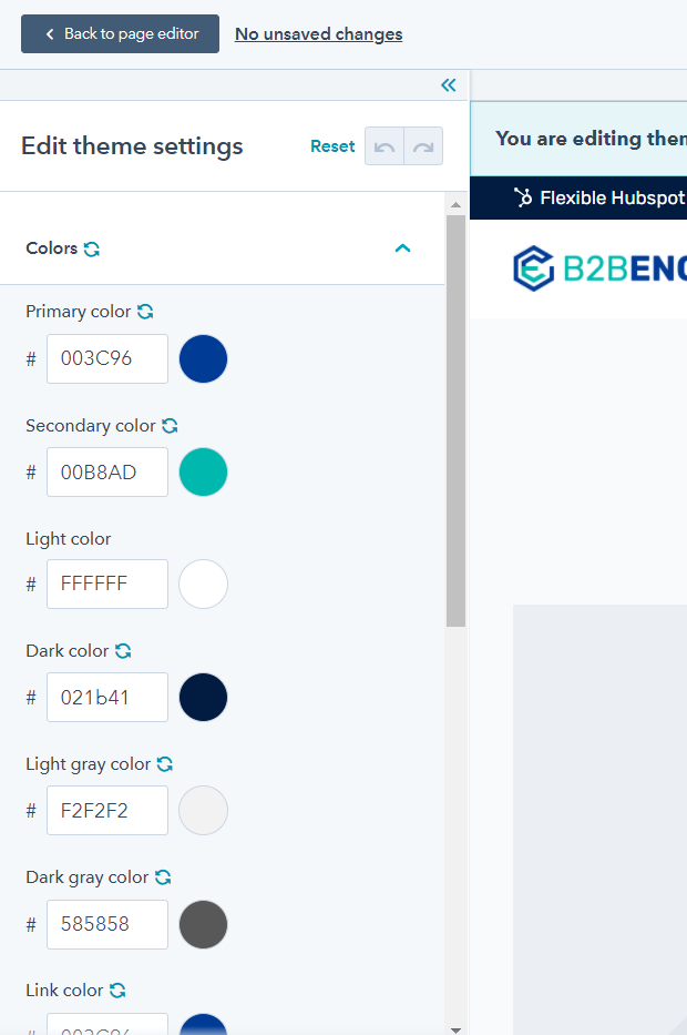
Colors
There are multiple colors that you can update to match your internal brand guidelines including: primary, secondary, dark, light, grey tones and link states. This color group will be available for selection and application across a majority of the included theme modules. To change the color, update the HEX code to match those of your brand colors, scroll to the bottom of your sidebar and select the ‘Apply Changes’ button.
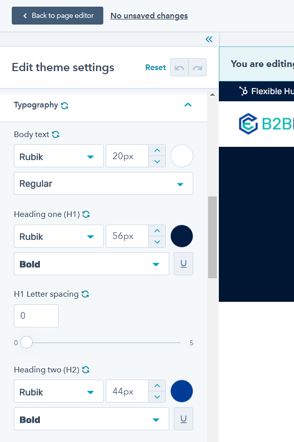
Typography
Under the Typography section, you are able to update the font family, size, color, weight, and letter spacing of the body text and headlines (H1-H6) of your website. HubSpot gives you the option of browsing through Google Fonts for use as well. Use the typography tools to manually set your hierarchy for desktop, the fonts will automatically scale for smaller screens and mobile devices. When you are done, click on the ‘Apply Changes’ button at the bottom of the sidebar.
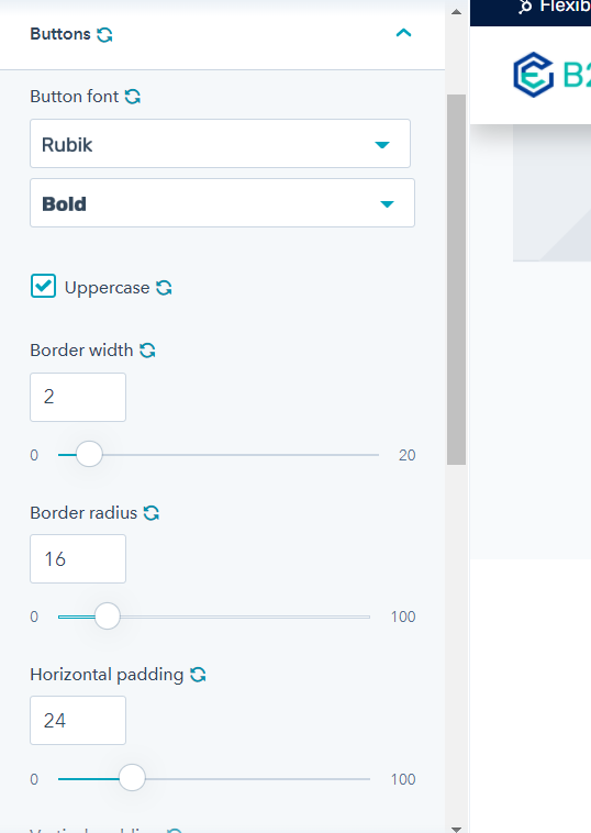
Buttons
Under the ‘Button’ tab there are style settings you can update which will apply globally. Ensuring consistency across all of the button variations available to you through almost all of your modules (Forms, Hero Banners, Cards, Buttons, etc.). These settings include font (family and weight) , border (width, border radius, letter spacing, and padding (horizontal and vertical). Once you have updated all of the settings, remember to click the ‘Apply Changes’ button.
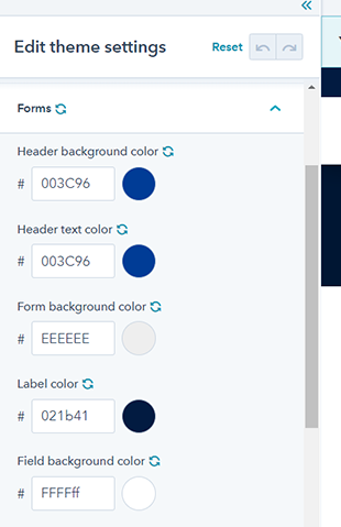
Forms
Here is where you are able to update the default color settings of your site form elements. These elements include: the header (background & text), body background, labels, fields (background & borders), focus borders, and buttons (background and text). When you are done setting the colors for your forms, click on the ‘Apply Changes’ button.
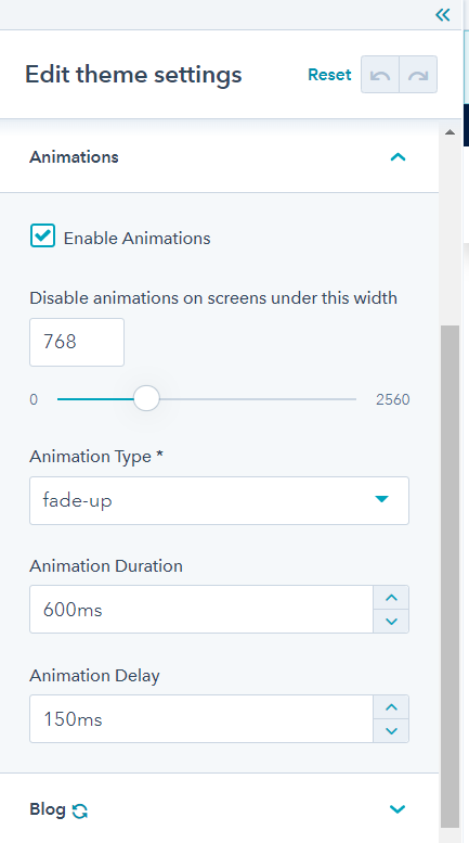
Animations
B2B Engine gives you the option to enable animations that will start when page elements are scrolled into view. Here is where you can choose the animation type, as well as set the duration and delay in milliseconds. These animations are site default and can be overridden on each module individually to allow for more complex options. There is also a slider which allows you to set a screen size (in pixels), below which animations will be turned off. To save your settings click on the ‘Apply Changes’ button.
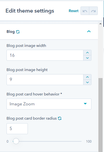
Blog
The settings in this panel will apply to the cards (posts) on the B2B Blog Listing template. Here you are able to update the aspect ratio or pixel dimensions of the blog post image (width and height). You are also able to update the corner radius of the cards and hover behavior (animation). To save your settings click on the ‘Apply Changes’ button.
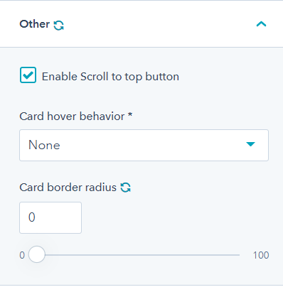
Other Settings
In the final two panels you will be able to:
- Update the border radius and hover behavior for the B2B Engine ‘Cards’ module.
- Enable a back to top button for your site
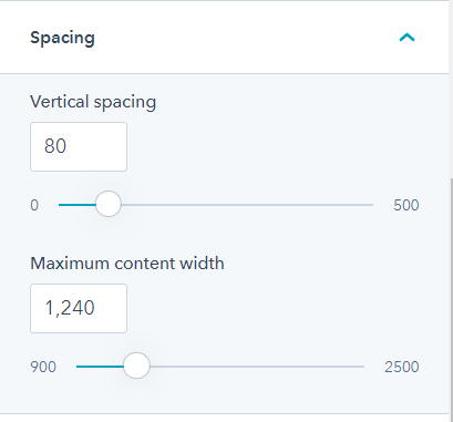
- Set the maximum width, and vertical spacing (top and bottom padding) of your site body content.
To save your settings click on the ‘Apply Changes’ button.
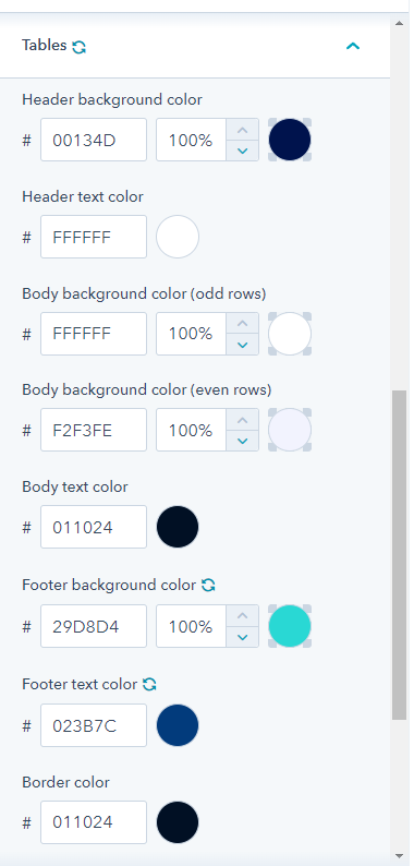
Tables - PRO Theme Feature
These settings allow you to customize the colors and borders of HTML tables.
Theme Customization: Global Content Editor
Your website header and footer modules are global modules, which means that updating their styling will apply across your entire website. You can learn more about global content in more depth in HubSpot’s development documentation here. To access the global content editor to update your header or footer, you must:
- First, open any website page in the page editor
- Follow the prompt to ‘Open in global content editor’
- Select the module name in the sidebar, and follow the prompt to ‘Edit the global module’
- You will then be able to update the individual settings specific to your global module.
- Once you have the settings adjusted to your preference, remember to click on the ‘Apply Changes’ button at the bottom of the Sidebar.
Global Header Settings
Branding
- Colors: Match the header of your site to your brand by updating the hex codes for the background and text color.
- The Logo Tab: Here you are able to upload logos for your site. There are settings for both a dark version, and a light version of your logo. You are also able to set a logo size (in pixels), and maximum size. You can also modify where the logo links to when clicked on by the website user (we recommend linking to your website’s Homepage.)
Menus
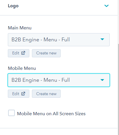
Use the dropdown menus in your header settings to select a HubSpot navigation menu that will display for both your desktop and your mobile website menus. Looking for a way to include a hamburger menu for desktop screens? Simply check the ‘Mobile Menu on All Screen Sizes’ box. To learn more about creating and editing HubSpot menus, please visit their Knowledge base.
Positioning
The B2B engine header gives you some control over how your header is displayed as the user navigates your site. The options are:
- Fixed (Navigation remains at the top of the window and accessible while scrolling through your website pages.)
- Static (Navigation stays at the top of your website pages while the user scrolls.)
- Reactive (Navigation is not visible when the user scrolls down, but appears at the top of the window once the user scrolls up.)
Top Bar
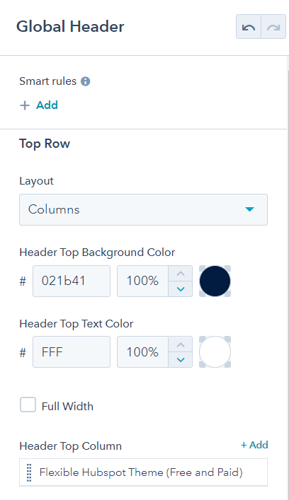
This is where you can add an announcement bar at the top of your header. The bar can be full width, or contain columns inside of it to structure your content. Use the dropdown menu to choose your the functionality of this bar (Columns, Message, or Search)
Columns – Allows you to add multiple column content. Each column can contain an icon, text, and a link.
Message – Is a single column solution to display one message, icon and link.
Global Footer Settings
- Footer Background: Use the dropdown to select the type of background you’d like your site footer to have. Your options are color, or image.
- Colors: Match the footer of your site to your brand by updating the hex codes for the background and text color.
- Columns: Hover over to column content to edit, clone, or delete a column. This will control how many columns are in the footer layout. We recommend limiting this to 4. Inside each of these columns, you can add and set various content types including:
- Search
- Content (Rich text module allowing for images and text.)
- Form
- Menu
- Blog Posts ( Listed titles of most recent posts from one of your HubSpot blogs that link to the full content.)
- Social Media Links
Copyright
This is where you can add messaging to the very bottom bar of your footer. We recommend adding your website’s copyright information here (Company Name, Year, Copyright Symbol).
Footer Menu
You are also able to add an optional menu to the right of the copyright information in the bottom bar. Use the dropdown menus in your header settings to select a HubSpot navigation menu. To learn more about creating and editing HubSpot menus, please visit their Knowledge base.
Theme Customization: Modules
Modules can be added, removed and rearranged using HubSpot CMS’ Drag and Drop functionality. To access your B2B Engine modules, simply click on the ‘Home’ tab of your sidebar. Looking for a list of the modules currently on the page you are editing, click on the ‘Content’ tab. For more in depth information about how to use HubSpot’s drag-and-drop content editor, please visit the Knowledge Base here.
For all modules, you will find options for the following in the sidebar:
- Animation: Use the ‘Enable Animation’ checkbox to enable animation settings for this individual module. Then, you will be able to use the dropdowns to set animation type, delay (in milliseconds), and override the default animation duration and modify it (in milliseconds) if desired.
- Custom Classes and ID: Looking for more customization options? There are included fields to add custom classes and a custom ID for greater flexibility.
To see the modules in use check out our demo pages:
B2B Engine
B2B Engine Pro
Now let’s take a closer look at the more specific module settings for each of the B2B Engine modules.
1. Accordion
Use the accordion module to feature content that you would like to be collapsible to save on page height, and provide an alternative for displaying text-heavy content in a simplified manner.
Accordion items:
- Hover over the accordion items to edit, clone or remove an expandable row of content. You can also reorder these items through drag and drop functionality. Inside each of the accordion items is a dedicated rich text module for you to add text, images, source code, etc.
- Colors: Use the dropdowns to select colors for the background and text color. The options for the colors are pulled from the colors set in your theme settings.
2. Blog Posts
- Layout: Use the dropdown to select the layout of your blog ‘cards’. There are two options, Grid, and Slider. Use the following dropdown menus in the sidebar to select:
- The number of posts you want to display
- The number of posts you want to have displayed per row
- Post Type: There is a required dropdown for you to select the type of post you would like to feature. There are three options ot choose from:
- Recent – which will populate the most recent posts from your selected blog.
- Popular – which will populate the most visited posts from your selected blog.
- Featured – which gives you the option to add any of your HubSpot content (posts, landing pages, and pages).
- Card Style: There are multiple settings that can be used to modify the style of the blog card. Use the dropdown menus in the sidebar to select:
- Text alignment
- Heading size
- Colors for card text and background
- Button type, color and text (You can also set the entire card as a link by checking the ‘Whole card link’ checkbox)
- The behavior of the card on hover
3. Button
- Button link: Use the dropdown to select where you would like your button to link to. You can choose:
- An External Link
- Content (your HubSpot Website Pages)
- File (Hosted in the HubSpot File Manager)
- An Email Address (Mail to link)
- A HubSpot blog post
- Button Style: There are multiple settings that can be used to modify the style of your button, but don’t forget, some of the global button styles will need to be modified in your theme settings. You will be able to update the following settings in the module itself:
- Button alignment on page
- Button text
- Color (from the options set in your theme settings)
- Text size
- Button type (Flat or Outline/with a transparent background)
- Popup: Instead of a link you have the option to add a pop-up window on click instead. Check the ‘Enable Popup’ box. This will allow you to update/add the following to your pop up:
- Image
- Headings (Main Headline & Subheadline)
- Body text (Rich text, images, source code, etc.)
- Form
- 1-2 Buttons
4. Cards
Use cards to show off your products, lead the user to key content across your website, or even introduce your team members.
Style Variations: There are multiple variations of styling available for the aesthetics of the card module. You can see an example of what all of them look like on the module page here. Use the dropdown menu in the sidebar to choose your preferred style
- Classic Card
- Classic Card (Icon) – Displays an icon instead of an image
- Image with Overlay and Title – Entire card displays a background image with overlay and title text over it.
- Image with Overlay and Title (Slide-In Content) – Displays the same as above, but with content that slides in from the bottom of the card on hover.
- Image with Overlay and Title (Pop-up Content) – Displays the same as above, but displays a pop-up window with the content on click (instead of sliding up). This pop up functionality will allow you to update/add the following to your pop up:
- Image
- Headings (Main Headline & Subheadline)
- Body text (Rich text, images, source code, etc.)
- Form
- 1-2 Buttons
- Layout: Use the dropdown to select the layout of your ‘cards’ there are two options, Grid, and Slider
- There will be another dropdown number of cards you want to have displayed per row (if using the Grid option).
- Cards: Hover over the rows of the ‘Cards’ section in the sidebar to edit, clone or remove an individual card. You can also reorder these items through drag and drop functionality. There are multiple fields and settings to edit in each individual card including:
- Alignment
- Card Image & Sizing
- Colors for card text and background
- Heading (size & content)
- Subheading
- Rich text content (text, images, source code, etc.)
- Button type, color and text (You can also set the entire card as a link by checking the ‘Whole card link’ checkbox in the previous sidebar window)
- Social links
5. Counter
Use counters to highlight important success metrics, or statistics reflecting your company’s successes.
- Counter Content: Each of the following fields are able to be updated for each individual counter added to your page:
- Icon (HubSpot logo will show by default. You have the option to pick from any of the HubSpot provided icons.)
- Number and Icon Color
- Text Color*
- Number
- Prefix (Text before the number)
- Suffix (Text or character after the number)
- Top Text
- Bottom Text
- Animation: Use the ‘Enable Animation’ checkbox to enable animation settings for this individual module. Then, you will be able to use the dropdowns to set animation type, delay (in milliseconds), and override the default animation duration and modify it (in milliseconds) if desired.
6. Form
Once you drag and drop the ‘Form’ module onto your page. The first step you are going to need to take is to select a form. You can do that by choosing one of your HubSpot forms from the dropdown, and clicking the ‘Apply Now’ button that pops up (this will make the form visible on your page). For more information on how to create and use HubSpot forms, you can refer to HubSpot’s Knowledge base here.
Form settings: A majority of the default form styling must be edited in your theme settings, however there are some settings you can update from the page editor. Those are:
- Choosing form field colors and a background color
- Turn off/on form padding (space surrounding the fields)
- Turn off/on the field labels
- Add a form title
- Update and edit your form fields.
- Set a thank you message (this will only apply on the page where you are setting it, not in every instance of the form).
- Choose follow-up action (you can learn more about follow-up settings here)
- Add the form to a workflow (learn more about workflow creation here).
7. Gallery
Use the gallery module to feature a group of images on your page.
Layout: Use the dropdown to select the layout of your Gallery there are two options, Grid, and Slider.
There will be another dropdown number of images you want to have displayed per row.
Gallery Images: Hover over rows under the ’Images’ section to clone, edit or remove an individual gallery image. Inside each of the images you will be able to update the settings for:
- Image selection and size (want to force all images to display at the same size? Check the ‘Enable Equal Image Size’ box in the Gallery settings).
- Adding a link or lightbox to the gallery image. Please note, only the images that have the lightbox option turned on will show up in the lightbox gallery view.
8. Hero Banner
Layout: Use the dropdown to select the layout of your hero banner from the three variations we have available (Text, Image + Text, Text + Image). For a visual example of what each of those can look like, take a look at our Modules page.
Banner Settings: Once you have selected your layout, you can then move forward with customizing your banner use the provided fields in the sidebar to update:
Your slide background: First use the dropdown to select either a color or an image background for your banner. To enable an overlay over your image background, check the ‘Enable Overlay’ box and use the Hex code and opacity settings to customize.
Text: Expand the text section to update your banner messaging. Under this tab you will have the option to edit:
- Alignment
- Text Color
- Heading (size, content, and underline)
- Subheading
- Rich text content (text, images, source code, etc.)
- Image: For the banner layouts that give you the option to add an image, choose an image from the File Manager by selecting ‘Browse Images’ or upload a new one. The image will appear on top of your hero background, to the left or right of your messaging.
- Additional options: Use the checkboxes below the image field to enable and edit additional options for your banner:
- Add 1-2 buttons
- Enable a custom width for the inner content container.
- Background image will remain full width.
9. Image
Use this module to add a single image to your design.
Image Settings: Once you have selected and uploaded your image (click on ‘Replace’ link to set an image in place of the placeholder image provided by the module), you can use the fields in the sidebar to set your image’s:
- Alignment
- Alt text
- Size
- Link or Lightbox
- Load settings:
- “Lazy” loading defers loading this element until it’s visible on the page.
This may help improve site performance. “Eager” loading loads the element right away.
10. List
List Style: Use the dropdown to select the style of your list from the three variations we have available (Bulleted List, Numbered List, Icon List, and custom image which allows an image to be used as an icon). For a visual example of what each of those can look like, take a look at our Modules page.
List Items:
Hover over the list items to edit, clone or remove an item. Inside each of the list items, you will be able to edit:
- The indicator color – color of the bullet, number or icon
Icon – If you select the ‘Icon’ list style, you can select an icon from the HubSpot provided icon library. - Text – This will be a simple text field (not rich text)
- Text Color: Use the provided dropdown menu to select a color that will apply to the text of all of your list items.
11. Section Options
‘Section Options’ is a module that can be used to expand the functionality and features of any ‘Section’ it is dragged into.
Use the checkboxes in the sidebar to add an enable for:
- A background overlay – to preserve legibility over background images.
- A top or bottom gradient – A linear gradient at the top or bottom of the section to help blend sections together.
- Reversing element order – Reverse the order of elements in the section, on smaller screens (when the elements start stacking on
each other). - Hiding a section – This will hide a section on the live site page, but keep it visible and editable in the editor view.
Use the dropdown in the sidebar to enable either a:
- Fixed Position – Fixed position fixes the background so that it doesn’t move with the rest of the site.
- Parallax Effect – Parallax makes the background move at a different (slower) rate compared to the rest of the site.
12. Social Links
Use the ‘Social Links’ module to add social media icons and links to your page.
Social Link Items:
We offer a list of preset icons to choose from for the major social channels (Facebook, instagram, linked-in, twitter, etc.). There is also an option to select an icon from a list of Hubspot provided icons.
Hover over the social link items to edit, clone or remove a linked icon. You can also reorder these items through drag and drop functionality. Inside each of the social links, you will be able to edit:
- Colors of icon and background
- Social Account
- Link & Link Setting (Open in New Tab, No Follow)
- Alignment
Use the dropdown menu to set the alignment on the page for the group of social icons. - Tabs
Use tabbed content as another alternative way to capture text heavy content, or to group and organize product/service specifications. - Settings:
Use the dropdowns in the sidebar to set colors for the body text and background. This will apply to all of your tabs in this module.
13. Tabs:
Hover over the Tabs in the sidebar to edit, clone or remove a tab from the tabbed content. You can also reorder these items through drag and drop functionality. Inside each of the ‘Tab’ items, you will be able to edit:
- The title of the tab
- The text color of the title
- The background color of the title tab
- Rich text content (text, images, source code, etc.)
14. Testimonial
Use the dropdowns in the sidebar to update:
Select the layout of your Testimonials there are two options, Grid, and Slider. For visual examples of each please see our Modules page.
If ‘Slider’ Is selected, use the checkboxes under the ‘Slider Options’ tab to enable arrows and dot navigation (dots which indicate how many ‘slides’ there are in rotation’
Alignment of the module content
Colors for the testimonial text and background – This will apply to all testimonials in this module
Image position, which will adjust the positioning of the images added to each testimonial item in relation to the testimonial text.
Testimonial items: Hover over the Testimonial rows in the sidebar to edit, clone or remove a testimonial from the grid or slider. You can also reorder these items through
drag and drop functionality. For each of the individual items you will be able to edit:
- The testimonial author’s name
- Author title at their company
- Quote
- Author image (i.e. headshot, company logo)
15. Text
Use this module to add a block of text to your page. You will have the option to add the following types of text to the block (Heading, Subheading, Intro Text, and Main Text). Intro text appears above the main text (below the headlines) and will be slightly larger than the main text itself.
Use the dropdowns in the sidebar to update:
- Alignment of the module text
- Color of the text. There are two options here:
- Dark- full color for use on a light background
- Light – White text for use on a darker background
- Heading Size
- Heading Underline
Use the remaining fields in the sidebar to populate:
- Contents of the Headline and Subheadline – Plain text field only
- Contents of the Intro and Main Text – Rich text option (text, images, source code, etc.)
16. Timeline
Use this module to tell a story, or explain a step by step process chronologically.
Use the dropdowns in the sidebar to update:
- Color for the central line accent, and for the bullets assigned to each row of the timeline.
Timeline blocks: Hover over the rows in the sidebar under ‘Timeline Blocks’ to edit, clone or remove a timeline block/item. You can also reorder these items through drag and drop functionality. For each of the individual items you will be
able to:
- Select or upload an image
- Update image settings (Size, load settings, alt text)
- Update the text content and settings under the ‘Text’ tab. These include:
- Alignment
- Heading (Text, Size, Underline)
- Subheading Text
- Body text (Rich text area)
- Text color
17. Career Listing - PRO Theme Feature
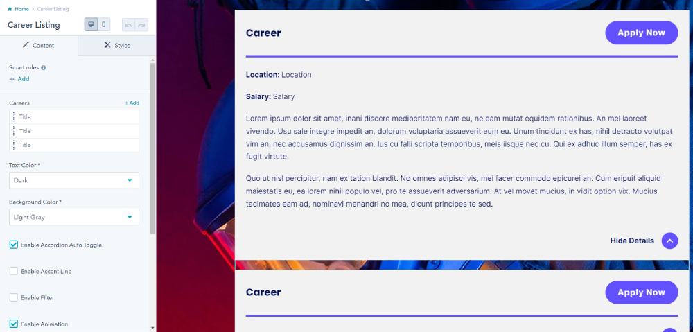
Use this module to create a list of job offers. Each listing has a title field, an apply button, location field, salary field, as well as a rich text field to add the job description, requirements and benefits.
18. Chart - PRO Theme Feature
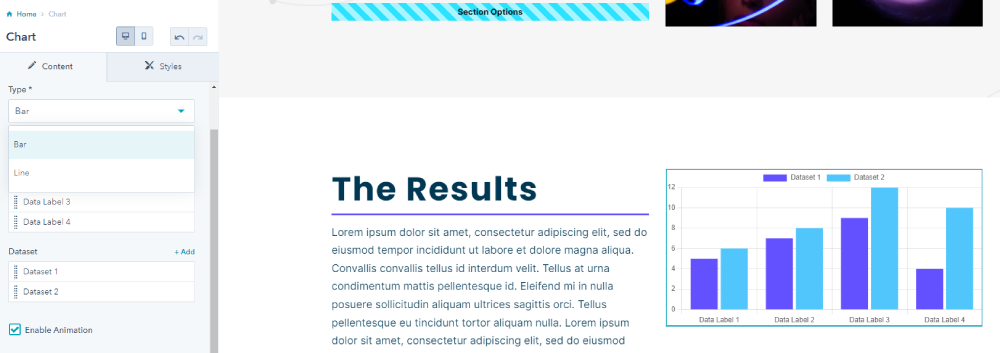
Use this module to display data as a bar chart or line graph.
19. Countdown - PRO Theme Feature
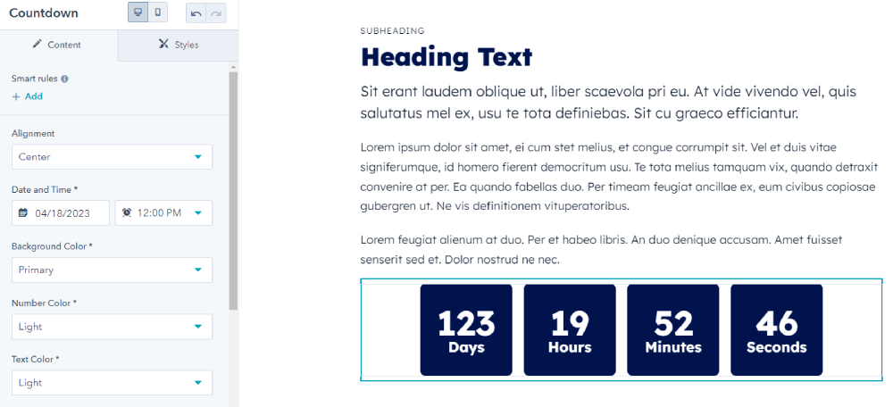
Use to create a visual countdown to the desired date and time.
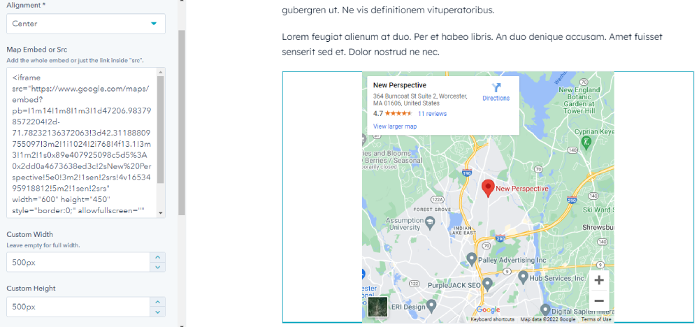
20. Map - PRO Theme Feature
Use to embed a Google map.
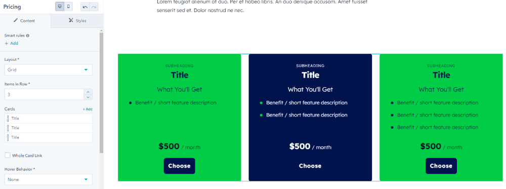
21. Pricing - PRO Theme Feature
Use this module to display and compare pricing plans for products and services.
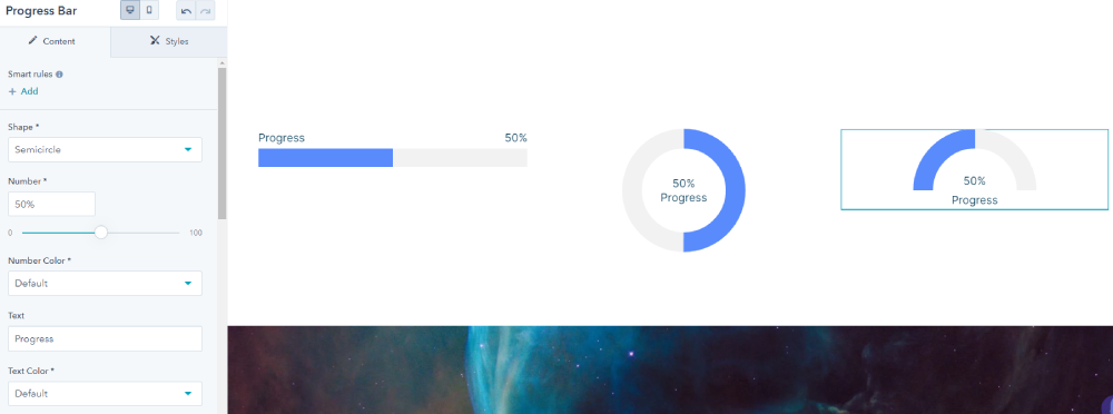
22. Progress Bar - PRO Theme Feature
Use to display an animated bar, circle or semi-circle progress bar.
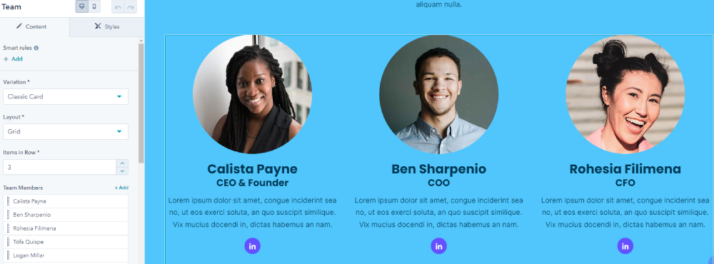
23. Team - PRO Theme Feature
Use this module to show team members, their bios, and social media links.
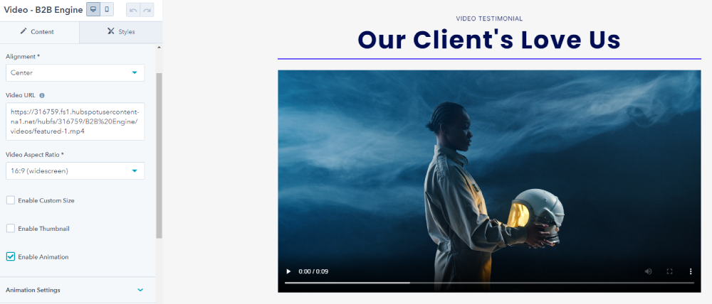
24. Video - PRO Theme Feature
Use to add a video to the page. There are options for thumbnails and popup videos. The moduel supports Youtube, Vimeo, and videos uploaded directly to HubSpot.
Additional Support
Have you reviewed all of our documentation and still not found what you are looking for? No problem. We are more than happy to support you with any issue or bug you may come across, or if you just have a general question.
Send a message to themesupport@npws.net to open a ticket with our team. It typically takes 2-3 business days to reply.